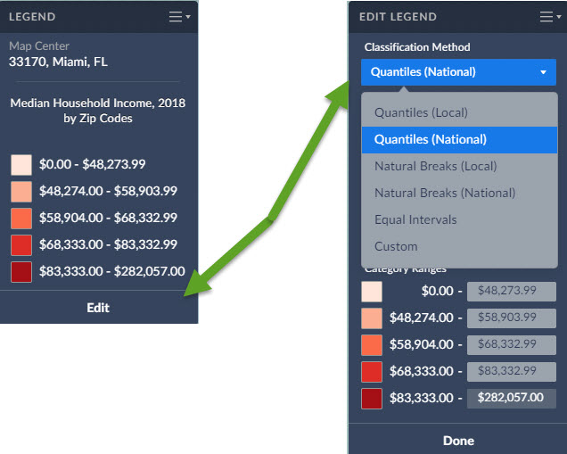
The classification method controls how the data in your map is grouped. Areas on the map are assigned to classes using different classification methods. The colors you see on the map depend on which class is assigned to each area.
There are multiple methods for calculating break values for the data. You can select any of the following from the Classification Method menu:

•Quantiles (Local)
•Quantiles (National)
•Natural Breaks (Local)
•Natural Breaks (National)
•Equal Intervals
•Custom
Quantiles (National): This is the default method used to classify each area on the map, and works for most situations. Breakpoints are calculated so that each category contains about the same number of features. "National" uses a sample of locations from throughout the USA to calculate the breakpoints.
Example: If there are 35,000 ZIP Codes nationally and you have 5 categories the legend is calculated so there are theoretically 7,000 ZIPs in each category.
Quantile classes (sometimes called percentiles) are perhaps the easiest to understand, but they can be misleading if the data being mapped is not distributed normally. For example, population counts are usually not suitable for quantile classification because only a few places are highly populated. Use population density or percentages for more meaningful maps.
Quantiles (Local): Breakpoints are calculated so that each category contains about the same number of features. "Local" uses a sample of locations from your current view to calculate the breakpoints. This method usually ensures the map will show more colors. For example, if there are 50 ZIP codes visible on your map, and you choose to display them in five classes, the map will show 10 ZIP codes per color.
Natural Breaks (National): Breakpoints are calculated using a statistical formula that finds groupings and patterns in the data. "National" uses a sample of locations from throughout the USA to calculate the breakpoints.
Natural Breaks (Local): Breakpoints are calculated using a statistical formula that finds groupings and patterns in the data. "Local" uses a sample of locations from your current view to calculate the breakpoints.
Equal Intervals: This method uses equal-size intervals for each class and color on the map. Breakpoints are calculated so that each category has the same range. This method doesn't care if all areas on the map end up sharing the same color. It sticks to a simple formula to classify each area on the map.This method is best applied to familiar data ranges such as percentages, medians and averages, and index values like consumer expenditures or product potential.
Example: if the lowest value nationwide is 1 and the highest value is 100 for that specific geography the legend will have 5 equal categories 1 to 20, 21 - 40, 41 - 60, 61 to 80 and 81 to 100
Custom: The user selects their own breakpoints by typing in their own values.
More information on data classification:
https://gisgeography.com/choropleth-maps-data-classification/