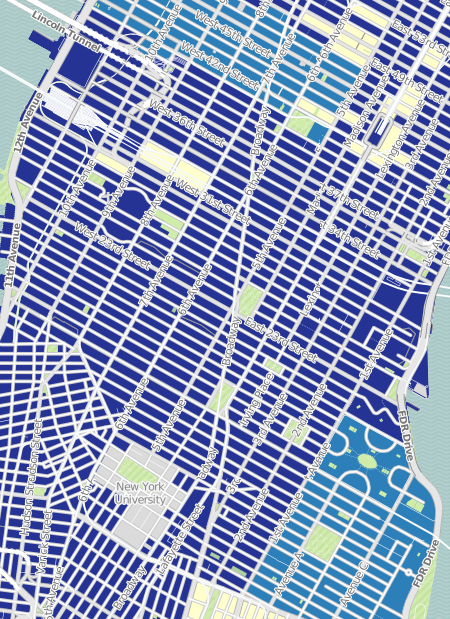
If your map is showing mostly one color like this:
There are two sure ways of adding more variety:
1. Change the Classification Method to Quantiles Local. By default, this is displayed as Quantiles National. You can do this by selecting Edit on the map legend.
2. Change the geographic unit to be smaller. Changing from ZIP Codes to Census Tracts or Block Groups can have a significant impact on your map. You can change this from the dropdown box at the top of the map.
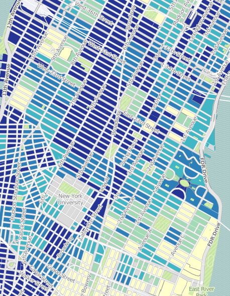
Look at the final result of the same image with the two options above applied: